
.png)
Tool Used :
Data Visualization: MS Excel
Database: MS Excel
Project Challenge: Big Fashion Group in Australia seeks to improve its sales performance and make informed decisions. Analyze sales by sales managers, sales trends by state, and category-wise sales, and provide actionable insights for the company's decision-makers. The goal is to identify top-performing managers, regional trends, and successful product categories to optimize operations and drive growth.
Project Summary: This sales analysis report provides a comprehensive overview of Big Fashion Group's performance in Australia, focusing on sales by sales manager, trends by state, and category-wise sales. The insights derived from this analysis will assist decision-makers in making informed business decisions to optimize performance and profitability.
------------------------------------------------------------------------------------
Want to know how i make this please follow below steps
What are the key features of MS Excel that will help to find such insight?
Key features are :

Data Import and Connection: Excel allows users to easily import data from various sources, including databases, spreadsheets, and web services. Its powerful data connection tools enable seamless integration, ensuring that your dashboard is always up-to-date with the latest information.

PivotTables and PivotCharts: PivotTables are Excel's secret sauce for summarizing and analyzing large datasets swiftly. They help in grouping, filtering, and aggregating data, while PivotCharts visualize this information in various chart types, offering a comprehensive view of your data

Excel Formulas and Functions: Excel's extensive library of formulas and functions facilitates advanced calculations and data manipulation. From basic arithmetic to complex financial modeling, these features enable users to derive valuable insights from their data.

Conditional Formatting: Conditional formatting in Excel allows you to highlight specific data points based on predefined rules. This feature is crucial for identifying trends, outliers, and areas that require attention within your dashboard.

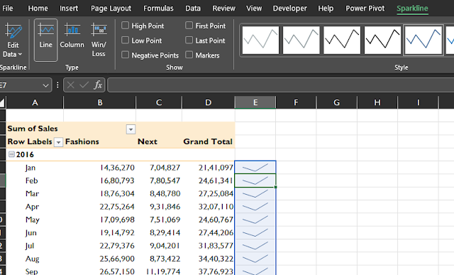
Sparklines: For a quick snapshot of trends and patterns within your data, Excel offers sparklines - tiny, in-cell charts that provide visual representations of data trends without the need for extensive charting.
Slicers and Timelines: Slicers and timelines provide interactive filtering options, allowing users to segment and explore data within the dashboard easily. They enhance the user experience by enabling dynamic data exploration.


Power Query and Power Pivot:
Excel's Power Query and Power Pivot features enable advanced data transformations and modeling. They are particularly useful for combining data from multiple sources and creating robust data models.
Below the attachment, you have go to power pivot ribbon in Excel and click Manage
The below image is the Power pivot interface

Data Validation: Data validation rules ensure that the data entered into your dashboard is accurate and consistent. This is critical for maintaining data integrity and preventing errors.

Macros and VBA: For highly customized dashboards, Excel supports Visual Basic for Applications (VBA) macros. These can automate repetitive tasks and add custom functionality to your dashboard.
** Please note in this project I am not using Macros and VBA
Please follow the steps :Step 1: Enable the Developer Tab
If the Developer tab is not visible in your Excel ribbon, you'll need to enable it first:
- Click on the "File" tab.
- Select "Options" at the bottom of the left-hand menu.
- In the Excel Options dialog box, choose "Customize Ribbon" on the left.
- Check the "Developer" option on the right and click "OK."
Step 2: Start Recording the Macro
- Click on the "Developer" tab in the Excel ribbon.
- In the "Code" group, click on "Record Macro."
Step 3: Define Macro Properties
A dialog box will appear where you can specify the details of your macro:
- Macro Name: Give your macro a unique and descriptive name (no spaces allowed).
- Shortcut Key (optional): Assign a keyboard shortcut to run the macro quickly.
- Store macro in: Choose where you want to store the macro. You can store it in "This Workbook" (available only in the current workbook) or "New Workbook" (available in all new workbooks).
Step 4: Record Your Actions
Once you've defined the macro properties, click "OK" to start recording your actions. Excel will now record everything you do until you stop the recording.
For example, let's create a simple macro that formats a cell:
- Select a cell.
- Change the font color, fill color, or any other formatting option.
- Click on the "Developer" tab again.
- Click "Stop Recording" in the "Code" group.
Step 5: Test Your Macro
Now that you've recorded your actions, it's time to test the macro:
- Select a different cell where you want to apply the formatting.
- Click on the "Developer" tab.
- In the "Code" group, click "Macros."
- Select your macro and click "Run."
Your recorded actions will be replayed, and the selected cell will be formatted accordingly.
Step 6 and Last: Save Your Workbook
Don't forget to save your workbook to ensure that the macro is saved with it. Macros are typically saved within the workbook.
Data Visualization and Charting: Excel offers a wide range of chart types and customization options, allowing you to create compelling visualizations that convey your data's story effectively.
Please follow the following steps :
- Chart Title: Add a descriptive title to your chart.
- Axes Labels: Label the x-axis and y-axis appropriately.
- Data Labels: Display data labels on the chart if needed.
- Legend: Customize the legend to explain data series if there are multiple.
- Chart Styles: Change the chart's color scheme and style.
- Chart Elements: Customize gridlines, axes, and other chart elements.
Step 1: Prepare Your Data
Before you start creating visualizations, ensure that your data is organized and clean. It should be in a tabular format with clear headers and relevant information. If your data needs cleaning or transformation, you can use Excel's Power Query tool to do so.
Step 2: Select the Data
Highlight the data you want to visualize. Ensure that you've selected all the necessary columns and rows to accurately represent your information.
Step 3: Insert a Chart
With your data selected, go to the "Insert" tab in the Excel ribbon. In the Charts group, you'll find various chart types like column, bar, line, pie, and more. Choose the chart type that best fits your data and click on it to insert the chart.
Step 4: Customize the Chart
Once the chart is inserted, Excel will create a default chart based on your data. You can customize it to make it more informative and visually appealing:
Step 5: Data Series and Axis Formatting
To enhance clarity and readability, you can format individual data series and axes. Right-click on specific chart elements to access formatting options.
Step 6: Add Data Labels and Data Points
You can choose to display data labels on the chart or hover over data points to show specific values. This adds context to your visualizations.
Step 7: Chart Design
Under the "Chart Design" tab in the Excel ribbon, you can further refine your chart's appearance:
- Chart Styles: Apply predefined styles to your chart.
- Data Table: Include a data table below the chart for reference.
- Switch Row/Column: Swap the chart's axis for different data interpretations.
- Add Chart Elements: Add chart titles, axis titles, data labels, and other elements.
Step 8: Save and Export Your Chart
Make sure to save your Excel file with the chart. You can also copy and paste the chart into other documents or export it as an image for presentations or reports.
Step 9: Update Data and Refresh Charts
If your data changes, you can update your charts by refreshing them. Right-click on the chart and choose "Refresh" or set up automatic data refreshing if you're using external data sources.
Step 10 and Last: Review and Refine
Always review your chart for accuracy, clarity, and relevance. If necessary, refine your chart by adjusting formatting, adding labels, or changing the chart type to better convey your message.
Download PDF
In summary, Microsoft Excel dashboards continue to be a go-to solution for businesses seeking to extract insights from their data. With a plethora of features for data import, manipulation, visualization, and collaboration, Excel remains an essential tool for professionals across various industries. By harnessing the power of Excel dashboards, organizations can make informed decisions, track key performance indicators, and drive business success in today's data-centric landscape.
.png)
